Beanfield’s B2C Customer Portal
Context: Residential users were struggling with an outdated customer portal that lacked the features they expected and needed.
Role: Lead UX Designer
Timeline: 6 months
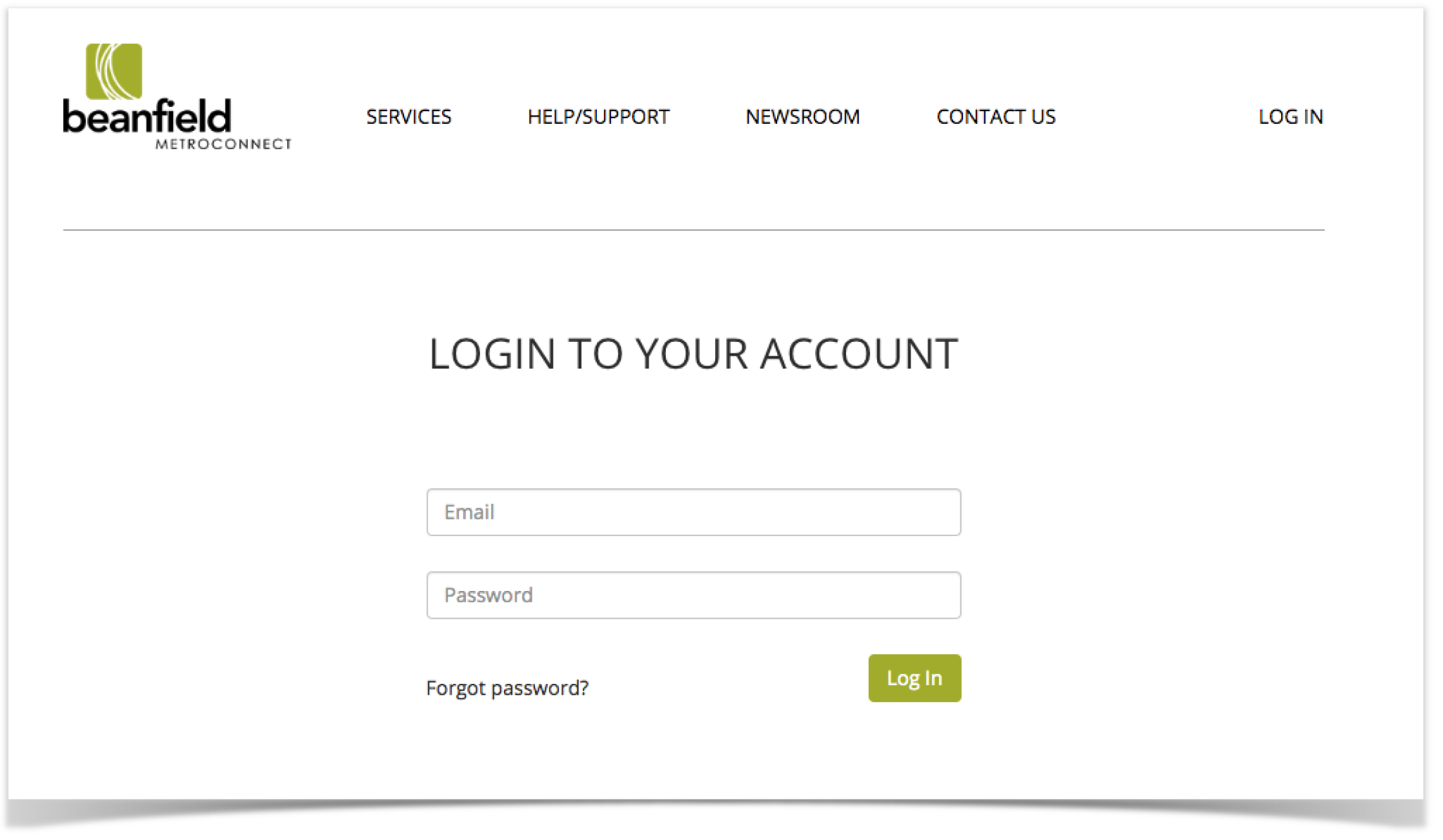
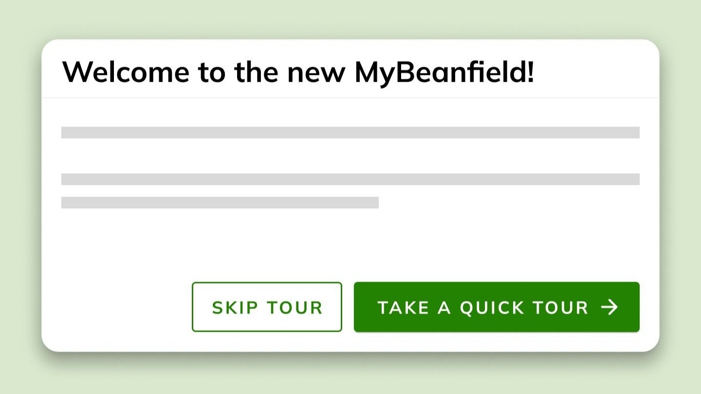
Previous version of the portal
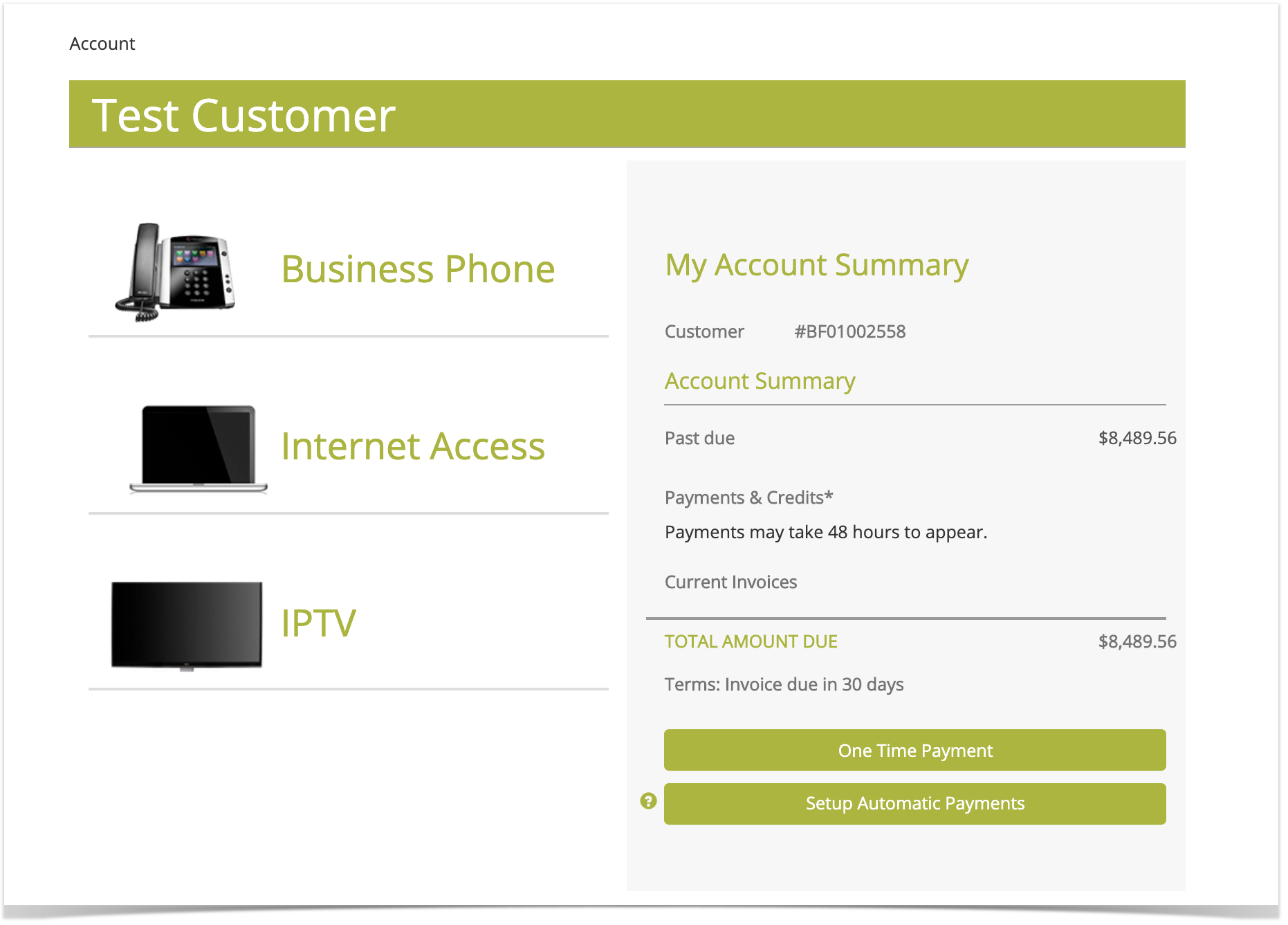
Previous version of the portal
Our primary goals were:
Improve customer’s online experience
Lower the amount of customer calls to Support
Have at least 5% of support tickets created via MyBeanfield
Add top features needed by customers
Ensure WCAG 2.0 compliance
The Design Process
1. Discover
The first step was to understand the existing portal and identify its issues. For that, I did an UX audit to identify user behaviour, discover where their needs were not being met and identify bugs and design issues. The main issues that became apparent were:
Poor navigation and discoverability
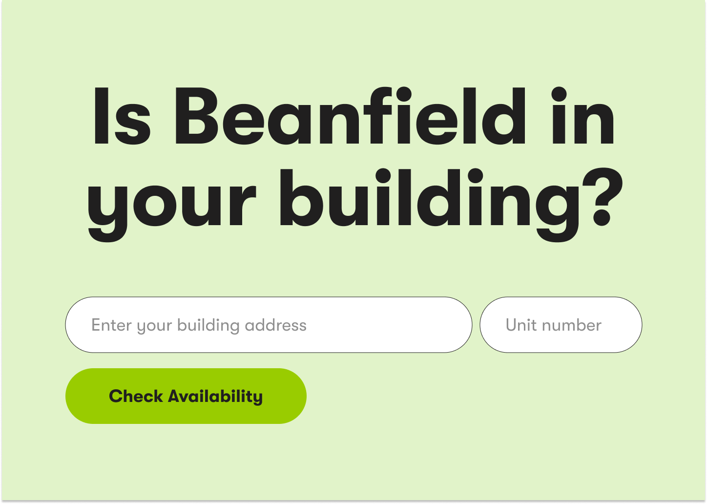
There was no clear menu to navigate the portal. A lot of pages were also hard to find and only accessible through unclear links.Lack of clarity
The billing breakdown was presented in a confusing way, resulting in many calls to support. The WiFi and network setting option were complex and riddled with technical jargon.No quick access to Support
No self-serve options
A lot of users accessed the portal hoping to manage their accounts, add services, see their payment history, and more, but those options weren’t available.Outdated design and lack of accessibility compliance
Non-responsive design
2. define
Based on the insights discovered before, I had a clear idea of which design strategy and direction to take to make sure the new portal responded to users’ needs.
Simplify: Organize content, straightforward navigation, discoverable workflows, user-centric language
Empower: Provide more options for customers to manage their account and services: Adding or removing services, managing their WiFi network, opening support tickets, adding and authorizing contacts, viewing invoice and payment history, and more.
Assist: Enhance the user experience by updating the design system to Hopscotch (Beanfield’s internal products design system), ensuring consistency, accessibility, and intuitive interactions.
I also sat down with the relevant stakeholders including the CEO, as well as Networks, Billing and Customer Support department directors, to understand the deeper needs and requirements of their respective areas.
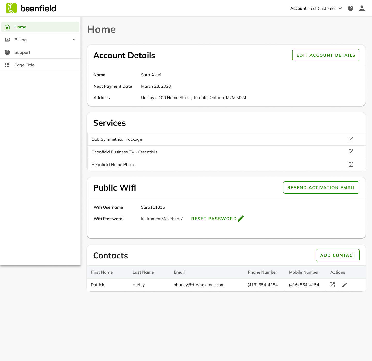
I worked on multiple hi-fi wireframes, focusing on optimizing the navigation
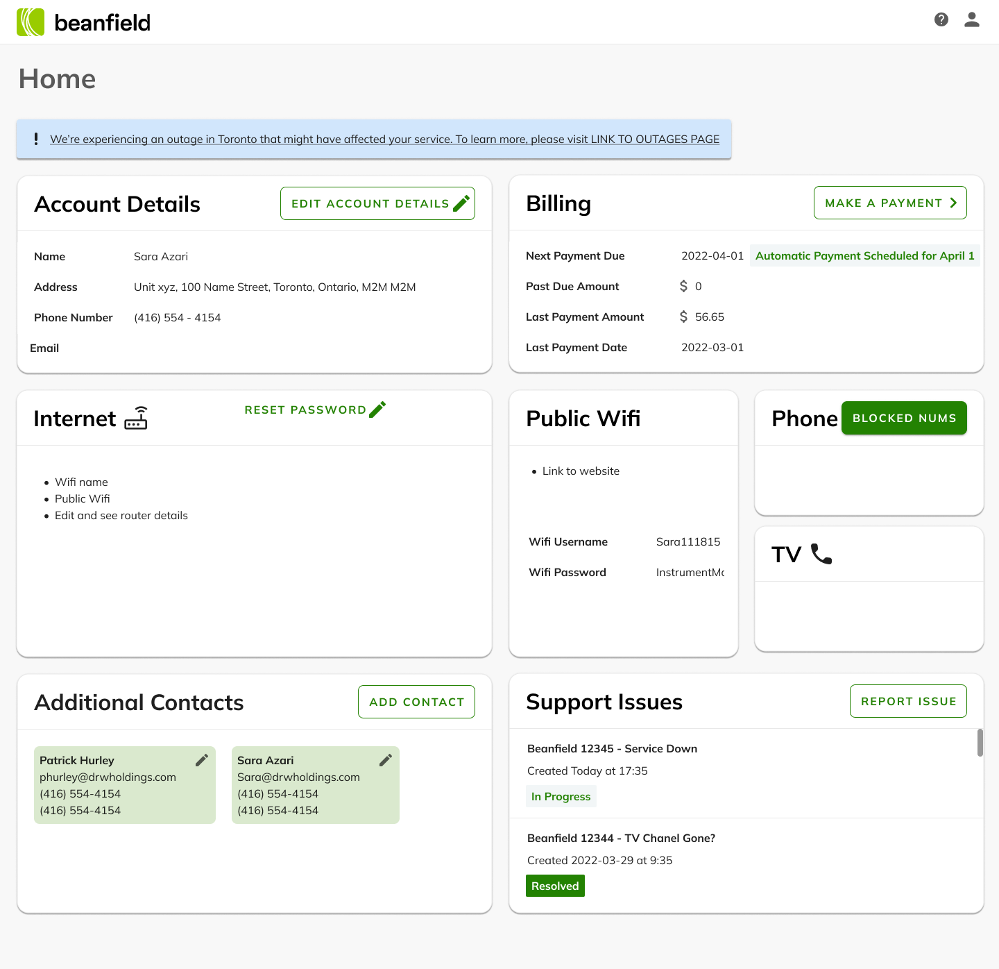
Final wireframe. Since the structure of the portal only had two layers of navigation, we decided to keep all elements onto a single page and skip any navigation bar or drawer
3. Develop
Once the wireframes were approved by stakeholders and we prioritized the workflows to include in the MVP launch, I created the high fidelity designs for all workflows:
Account Details: Edit Account Details, Change Password, Adding and authorizing contacts
Billing: Make a one-time payment, Set up Autopay, Pay via bank, view payment history
Internet: Edit WiFi network name and password, separate 2.4 and 5Ghz networks, enable guest network,
Advanced settings: Network overview map, port forwarding rules, DHCP leases and reservations
Support: Report issues
There were a lot of intricacies and aspects to consider in each workflow, so I had to closely collaborate with multiple departments to make sure everything made sense.
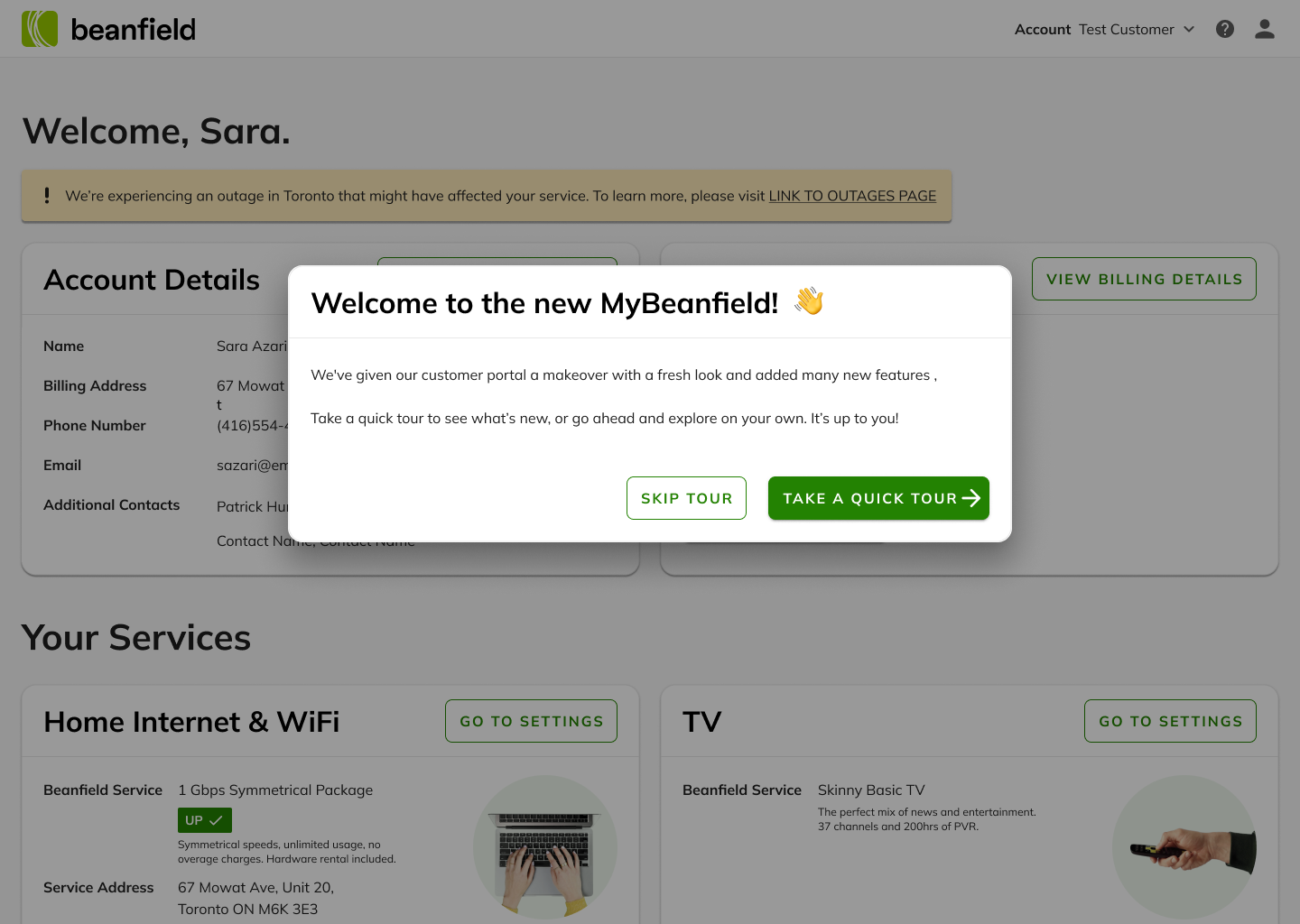
The new customer portal was launched in December 2023 🎉
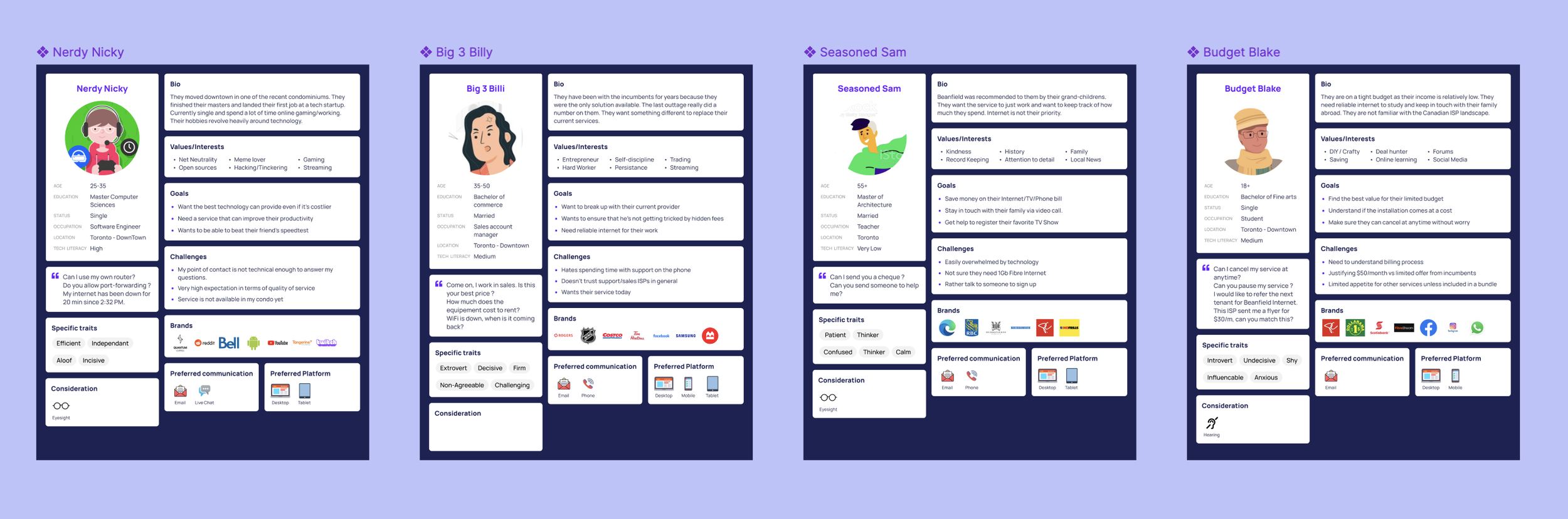
Our four User Personas: from the tech-savvy millennial to the older boomer with minimal technical knowledge.
After getting mockup approval from stakeholders, we decided to develop this product and usability testing in the staging environment.
We tested with 4 individuals and received a SUS score of 92.5, which is considered Excellent on the SUS scale.
After making some final changes and addressing the feedback received, we were ready to launch!
4. Deliver
After updating the mockups, I collaborated closely with developers to ensure the build met specifications. I also created mobile-sized mockups to show what the expected responsive behaviour should be.
For the launch, I proposed and secured stakeholder approval for a Product Tour to provide customers with a quick overview of the changes and new features of their updated portal.
Results
Over 30,000 customers used the portal in the first year
3 months after launch, 10% of support tickets were being created via the MyBeanfield portal
However, the Customer Support experience was still receiving a lot of billing-related calls.
We received great feedback and even feature requests from customers
What’s Next?
Since launch, I’ve been working on more features: Purchasing services through the portal, pausing and canceling services, payment suspensions, outages notifications. These are currently under development.
We have also started the planning phase of the B2B customer portal redesign.