Timeline
June - July 2021 (8 weeks)
My Role
Ideation
Usability testing
Mockups
UI Design
Problem
When a user clicks on the “Get in Touch” button on the B2B website, they are redirected to a contact form at the bottom of the page. However, 75% of the users that click on the CTA do not fill out the form.
We decided to address this issue and upgrade the contact form design in order to lower the barrier of entry, make the form friendlier and improve the user experience during and after they submit it. The ultimate goal being to increase the number of form submissions.
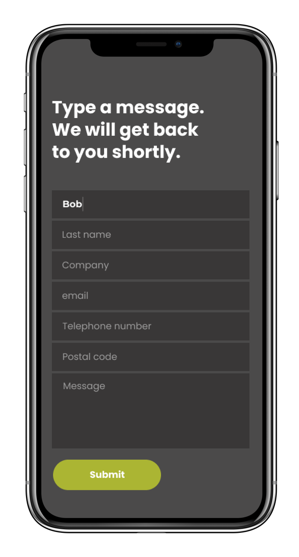
Previous version
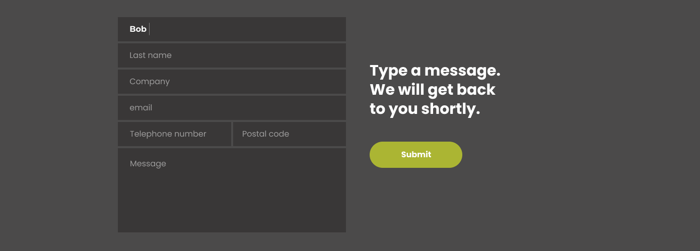
Previous form at the bottom of the page
Usability Testing
Due to budget and time constraints, we had to do usability testing with employees to gather feedback. The most common complaint we received was that the form was too vague and did not provide enough information for the user to feel confident enough that their message would be seen by a human or that they would receive a prompt response.
“This is all too vague. I don’t know what will happen once I hit submit.””
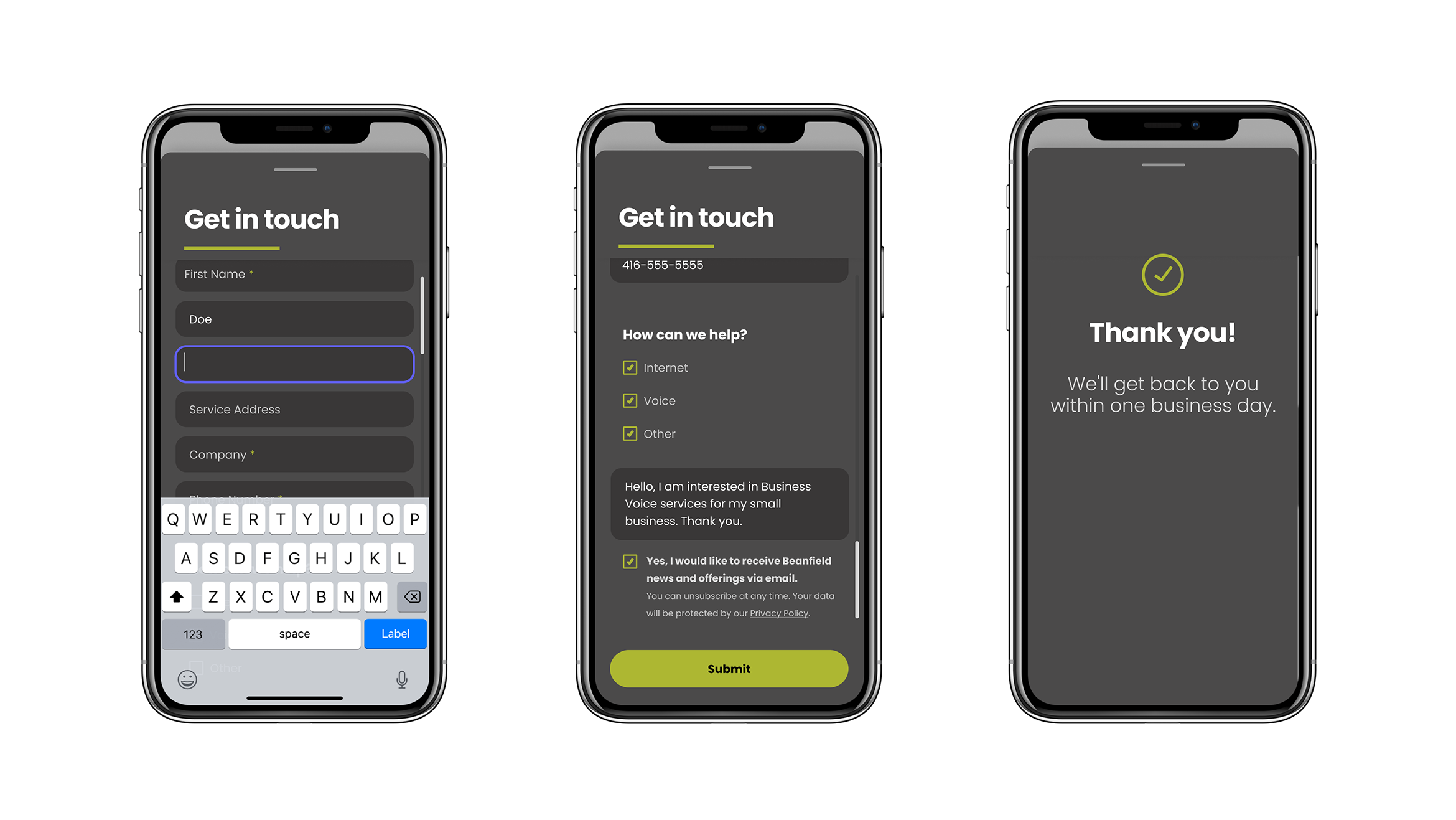
Solution
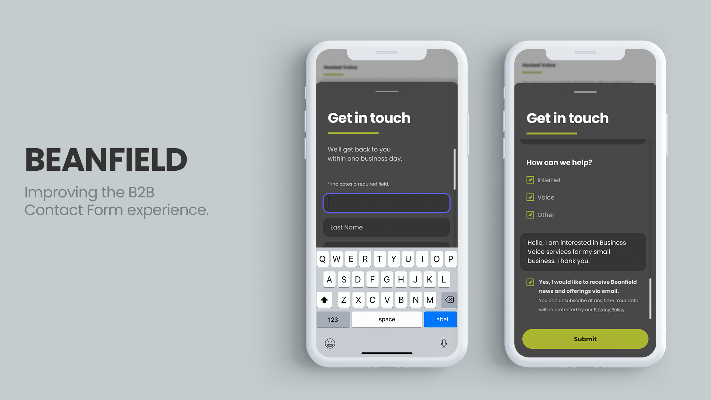
We decided to test a slide out panel so that users would remain where they were on the page. Improved the messaging, field grouping and sections.
We still kept the form at the bottom of the page so users who do not click on any CTAs still have the opportunity to find and fill out the form.
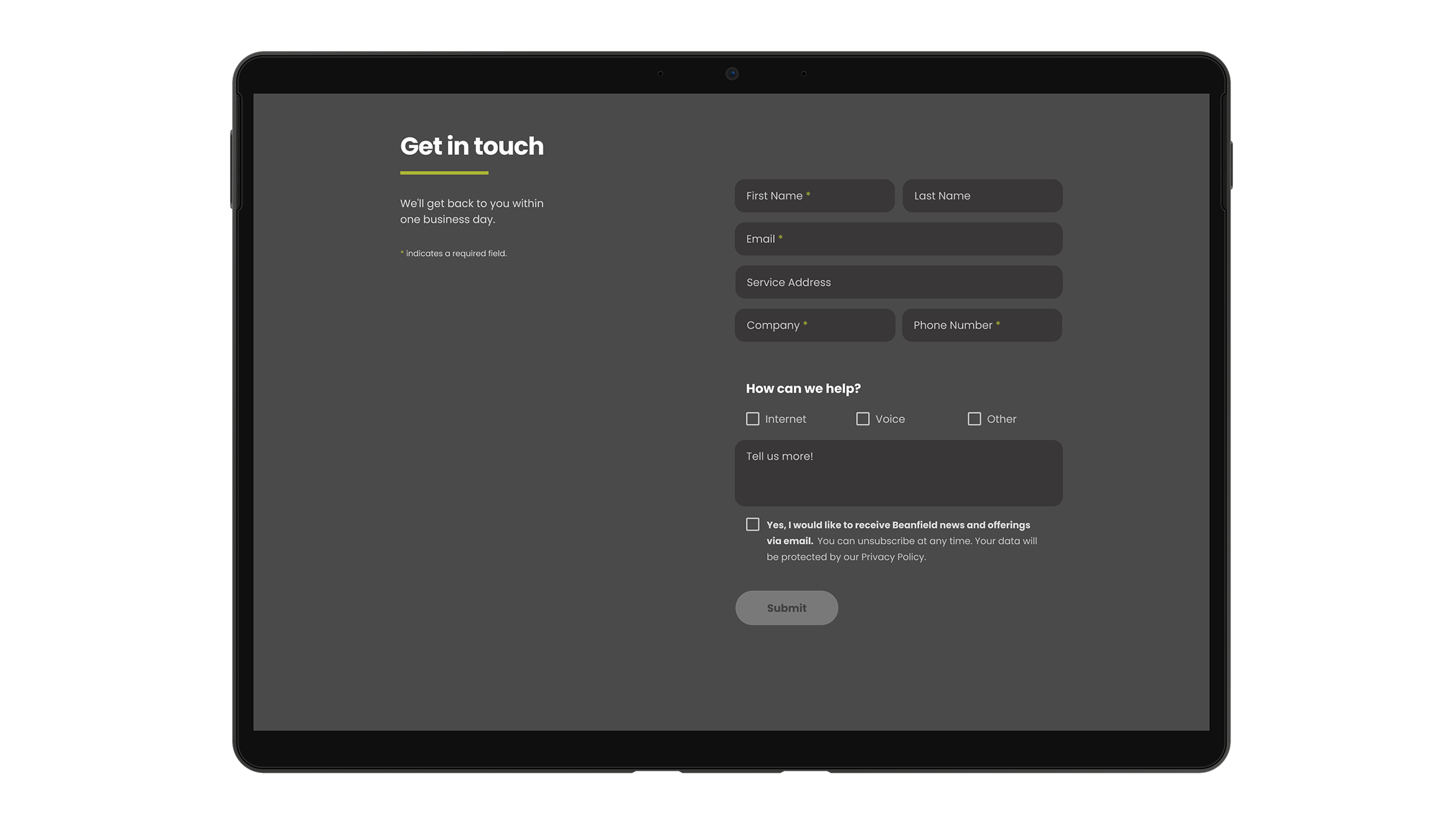
UI Design
I worked on making the form more accessible and friendlier by:
Addressing the colour contrast and accessibility issues
Implementing a clear disabled state for the Submit button
Clearly identifying required fields
Improving the text hierarchy
Rounding out the field corners and spacing them out for more breathing room